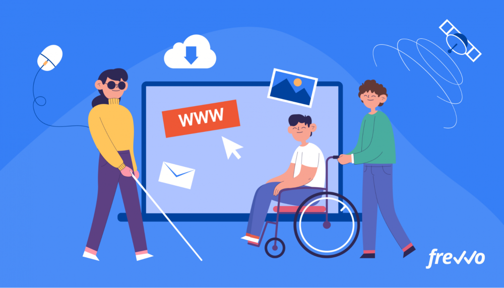
When we think of accessibility, we often think of physical access — making sure that buildings and structures are accessible and comfortable for students of varying abilities.
But accessibility in the digital world is just as important.
7.3 million students, or 14% of all public school students, received special education services under the Individuals with Disabilities Education Act (IDEA).
As a higher education institution, you’re committed to fostering an inclusive environment where every person can enjoy the student experience.
Accessibility has also become important for the government, which must support the needs of a diverse set of constituents. Government also sets guidelines for colleges and universities, healthcare organizations, and other institutions to follow to make sure their facilities and digital properties are accessible.
Following these guidelines and becoming digitally compliant hasn’t been easy for educational institutions, healthcare providers, and public sector agencies as it requires technical and legal assistance to execute.
In this article, we’ll cover the levels of compliance, what this means for your online properties, and how to make an ADA form fully accessible.
Click the links below to jump ahead:
- ADA Compliance: Institutions are Facing Difficulty
- Accessibility Regulations: What It Means to Comply
- WCAG 2.0 Priority Levels
- Section 508 Compliance For Online Forms
- How to Create an ADA Compliant Form
- frevvo Forms: ADA Compliance is a Point and Click Away
If you prefer, you can also watch a short video (2.5 minutes) of how to create ADA-compliant forms and workflows with a single click.
ADA Compliance: Institutions are Facing Difficulty
The ADA stands for the Americans with Disabilities Act of 1990.
It was created to protect the rights of people with disabilities from facing discrimination in the private and public sectors. Under its tenets, all people, regardless of disability, should have the same access to physical and digital properties.
In other words, digital properties like websites must be accessible to people with disabilities.
Years ago, the guidelines focused primarily on physical access, which for institutions has been easier to comply with. In 2008, the law was revised to impact the digital landscape, which broadened the definition of “disability.”
For example, the rise of digital forms and courses, however, has made it difficult for higher ed organizations to comply with the ADA.
The University of California at Berkeley came under fire in 2017 from the U.S. Department of Justice (DOJ) to make its digital courses fully accessible to the deaf or hard of hearing or those with visual or manual disabilities.
The DOJ found UC Berkeley in violation of the ADA. As a result, UC Berkeley announced it would close its courses.
Harvard and the Massachusetts Institute of Technology (MIT) also suffered backlash when they were sued by the National Association for the Deaf for neglecting to add closed captions to their online course videos.
People become frustrated when they can’t access essential functions. If an individual feels that an institution hasn’t done enough to make their services accessible, they can fill out an ADA complaint form and submit it to the DOJ.
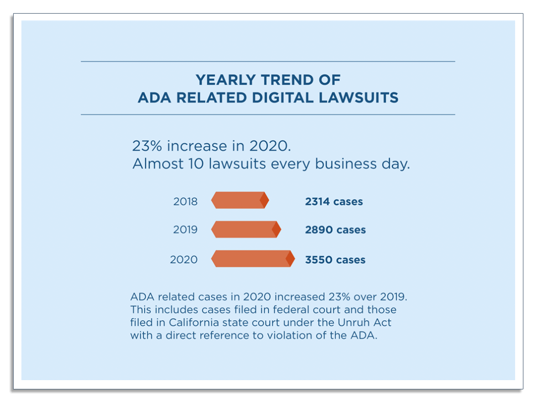
In 2020, there were 3,550 ADA-related lawsuits, an increase of 23% from the previous year.
It’s not just higher ed institutions that have to comply with ADA requirements. ADA rules also apply to organizations that meet any of the following criteria:
- K-12 school districts
- Local, county, state, and federal agencies
- Regulated entities like healthcare and financial services institutions
- Businesses that serve the general public
- Employers with at least 15 employees
Since ADA covers digital properties like websites, it’s important that you take steps to meet these requirements or you risk facing hefty fines.
Accessibility Regulations: What It Means to Comply
In working toward ADA compliance, organizations follow the Web Content Accessibility Guidelines (WCAG) 2.0 for web accessibility. WCAG 2.0 is part of the World Wide Web Consortium (W3C) guidelines.
Let’s take a closer look at these requirements.
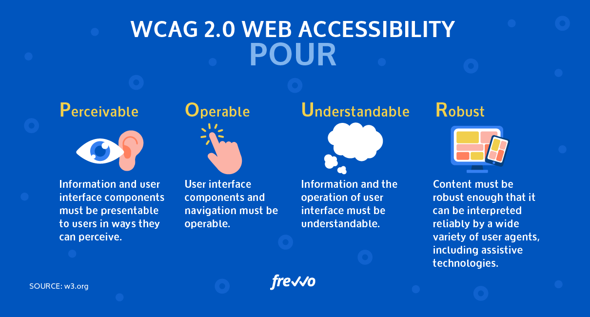
Web Accessibility Principles: POUR
WCAG 2.0 organizes web accessibility into four categories or principles:
- Perceivable
- Operable
- Understandable
- Robust
According to W3C recommendations, the definitions are as follows:
- Perceivable: Information and user interface components must be presentable to users in ways they can perceive.
- Operable: User interface components and navigation must be operable.
- Understandable: Information on the page and the operation of the user interface must be understandable.
- Robust: Content must be robust enough that it can be interpreted reliably by a wide variety of user agents, including assistive technologies.
Each of the POUR principles also includes three levels of conformance (A, AA, or AAA), with A corresponding to the minimum level of compliance, AA to medium, and AAA to the maximum.
The higher the rating, the more groups of people who will be able to access the web content.
Let’s take a look at these principles in more detail.
Perceivable
Perceivability refers to a user being able to use their senses to fully perceive and understand the content. For some, this may mean visual perception, while for others, it could involve using touch or sound.
If you create an online application form, perceivability is ensuring that the information can be perceived regardless of the user’s disability.
Can a user with a hearing or visual disability watch and hear your video, read your PDF, or distinguish the text color on a background from similar colors?
Here are ways you can make your website more perceivable:
- Provide captioning for your videos
- Include readable field labels on your forms
- Add ALT text to your images so a user’s screen reader can “read” it
- Enable resizable text and enable text-to-speech options
- Use strong contrast to make your content readable
People with low contrast sensitivity and color blindness may have difficulty reading your content if there’s insufficient contrast between the text and the background.
Here’s an example of color contrast ratings:
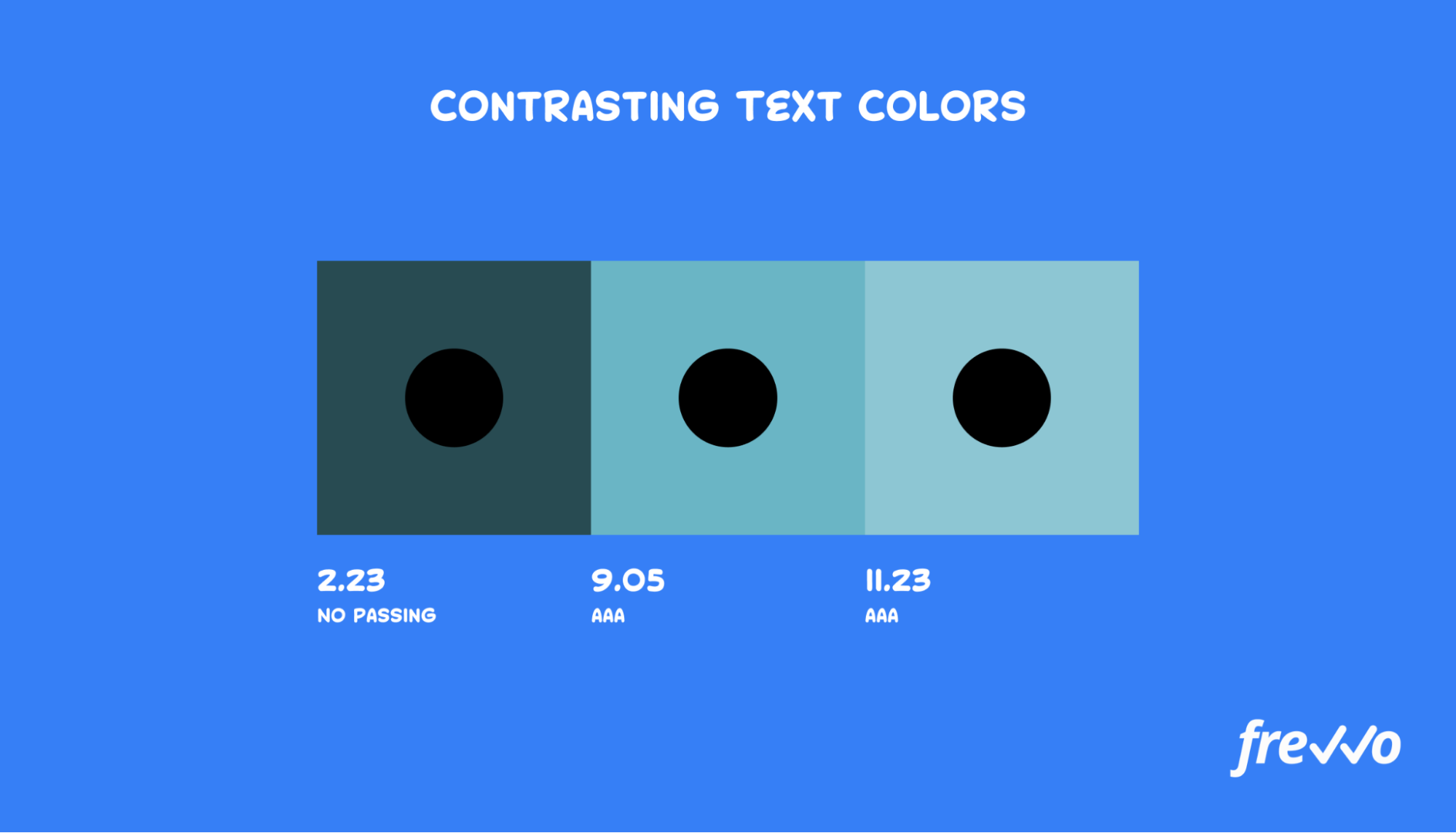
Use strong contrasts to make your web content easily readable.
Operable
Operability refers to how people interact with your website.
This may involve interactive elements, such as navigation links and buttons, and how the user can click or perform other actions.
Accessibility may also require implementing ways for users to control their movement with keyboard controls or voice commands to make your content fully accessible.
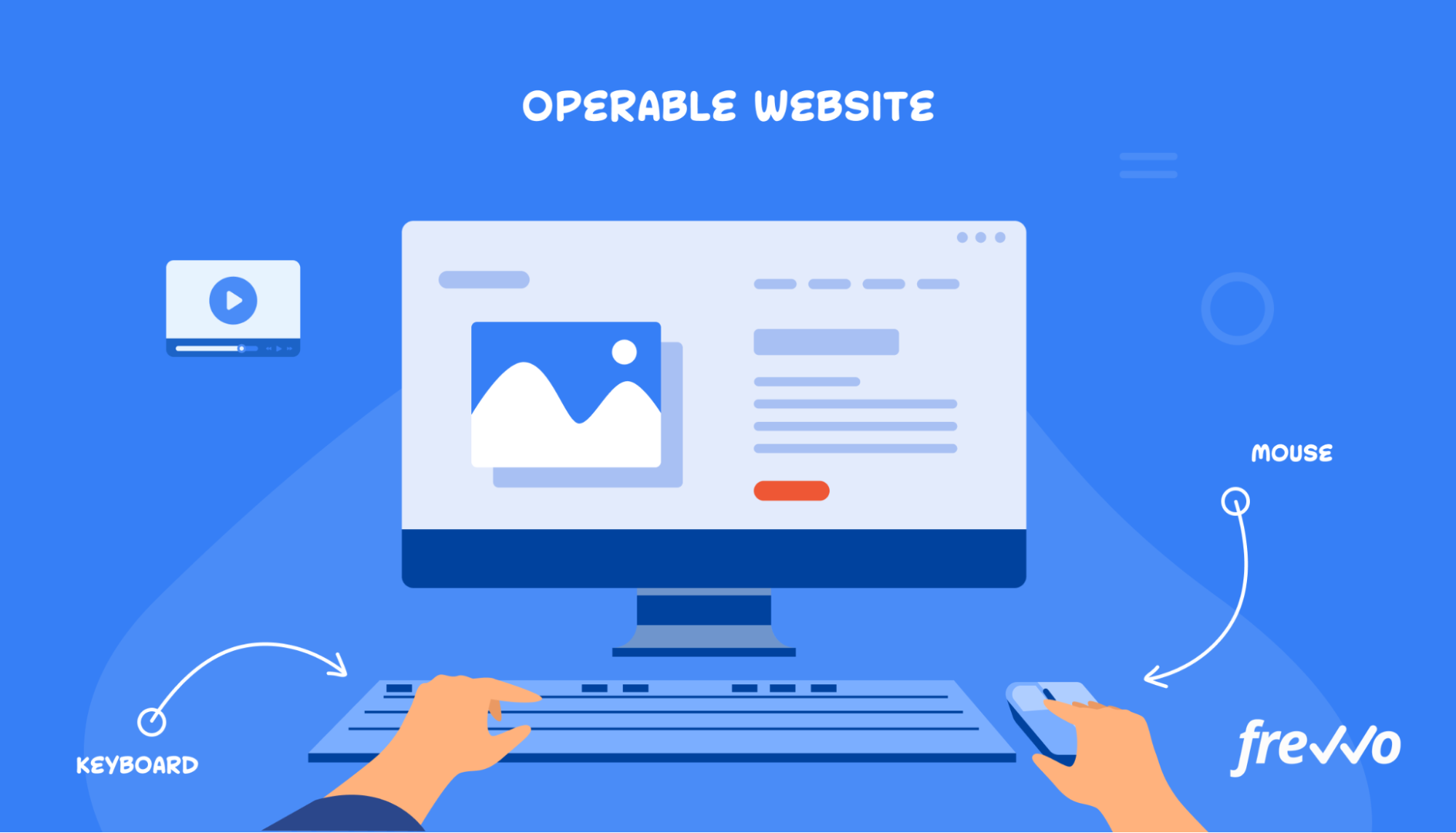
Ways to make your website operable include:
- Ensure that users can use their keyboards to navigate your site
- Create a logical structure and keep it consistent across all pages
- Include search features and site maps
- Give users the ability to control media players
Here’s an example to help you picture why operability is important.
Alex is a reporter who developed a repetitive strain injury, which makes it difficult for him to use a mouse for extended periods.
He’s able to work with less pain using assistive technology, but he still frequently encounters websites and forms that he can’t navigate with keyboard commands.
Make sure that users can navigate your website and fill out online forms with their keyboards.
Understandable
Is your content consistent and easy to comprehend? Paying attention to predictability and consistency in formatting, layout, and language will make your content fully understandable.
Some examples of consistency and predictability to aid understanding include consistent navigation throughout your website, input errors on forms, and consistent language in documents.
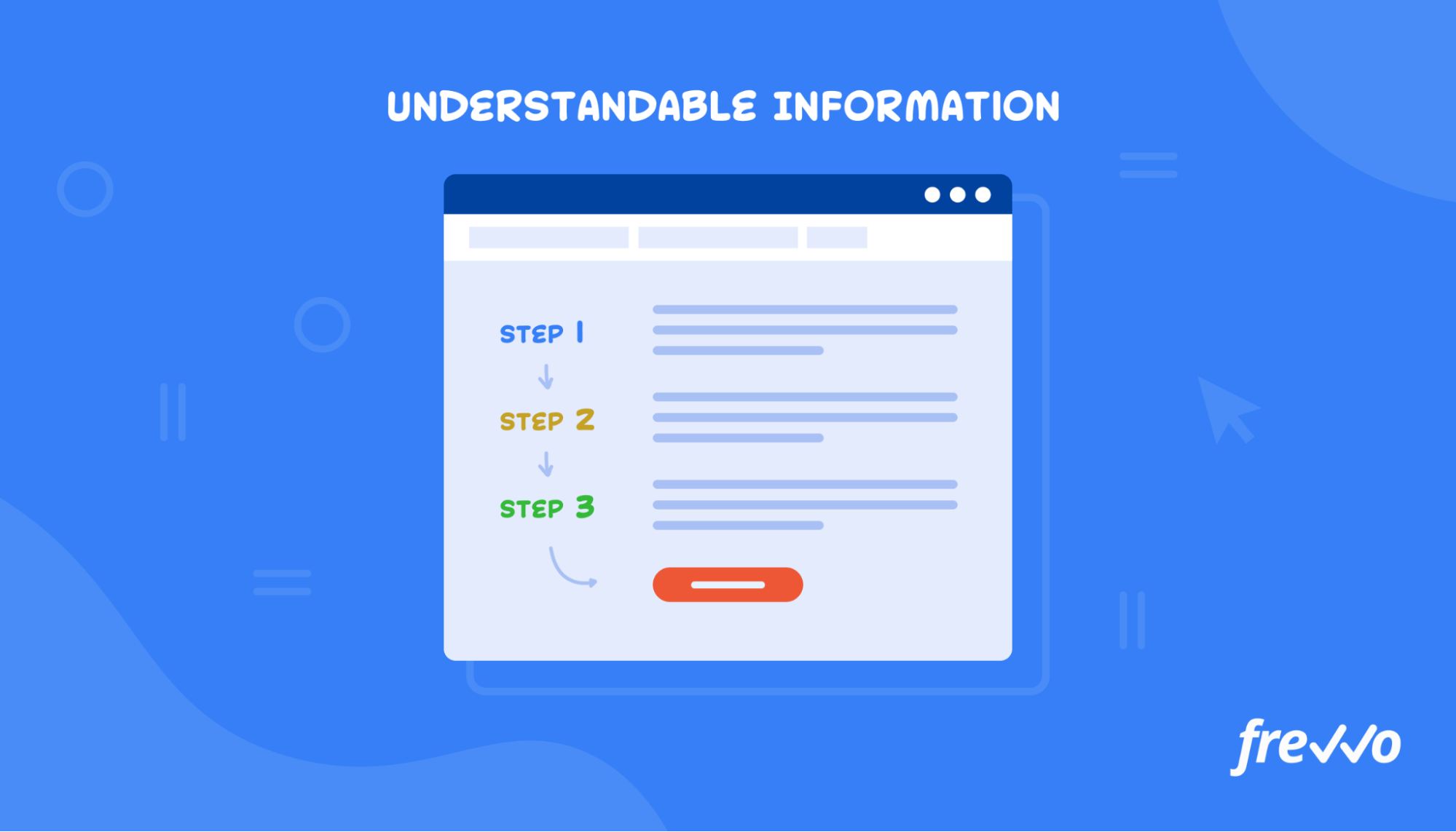
Here’s how you can make your content more understandable:
- Define abbreviations and acronyms
- Provide confirmation screens
- Give instructions and contextual help
- Use clear language and avoid jargon when possible
These principles also apply to your online forms.
Users can feel frustrated if they make a mistake and don’t know why they can’t proceed. Include descriptive labels and clear input errors on your forms.
Here’s an example of an accessible form:
These errors let users know what errors they need to correct and which fields are required.
Robust
Your website and forms should function optimally (within reason) across all technologies for which it was created.
For example, if you create a form that requires a specific browser to operate, all users should be able to download or access that browser.
Follow these best practices to ensure your website is robust:
- Ensure your website and forms work on all browsers
- Use a W3C validator to identify any markup errors
- Avoid using outdated technology like Flash
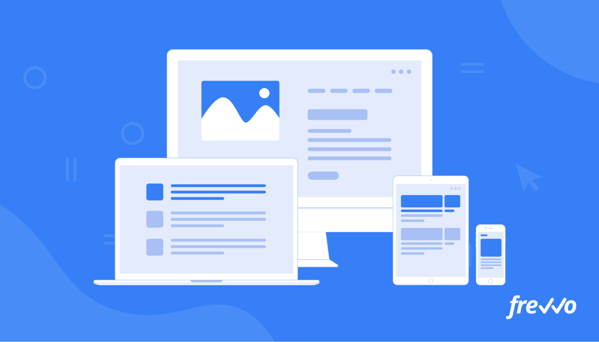
More people are accessing the web from smartphones and tablets. Use a simple mobile form builder to create an accessible form that works on all devices.
WCAG 2.0 Priority Levels
As previously mentioned, the A, AA, and AAA priority levels denote the level of accessibility.
We won’t have time to go into detail on each rating, but as an example, here are the ratings for one guideline (non-text content like images and videos):
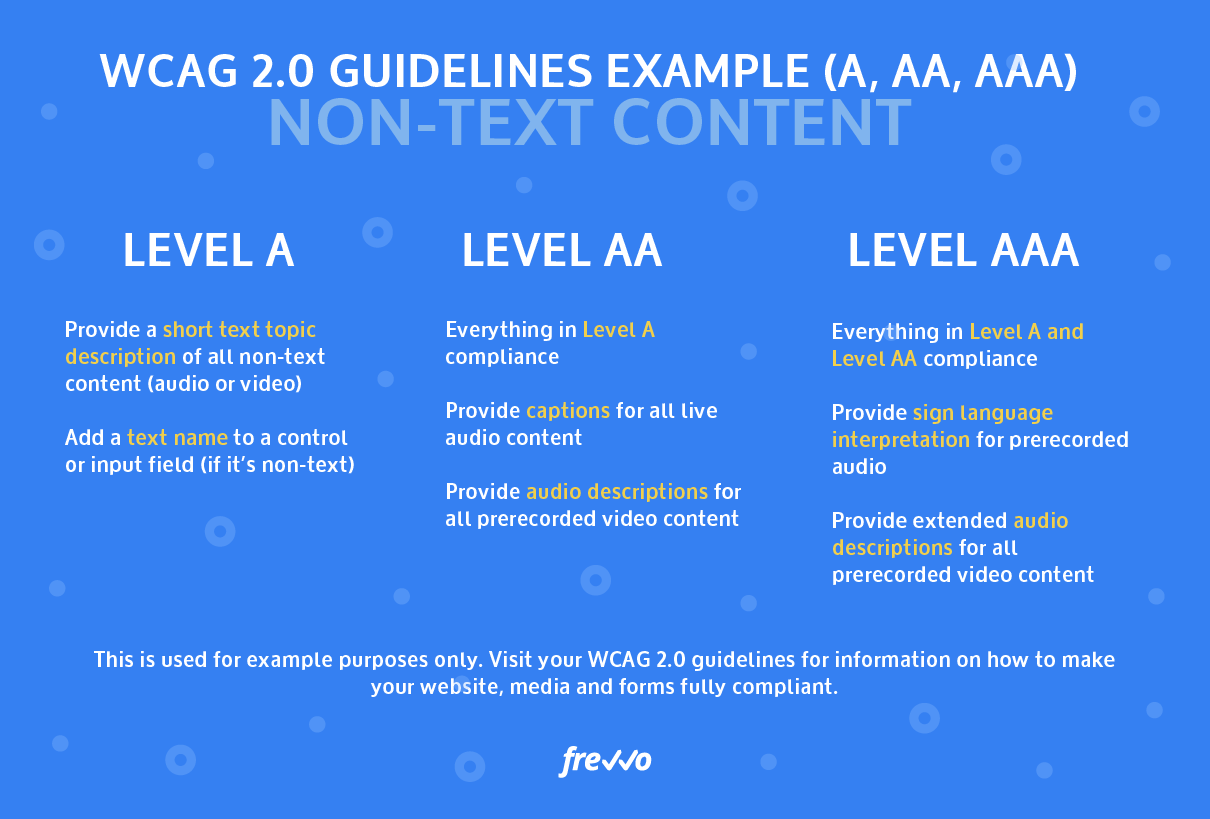
Some actions for Level A compliance may include:
- Provide a short text topic description of all non-text content (audio or video)
- Add a text name to a control or input field (if it’s non-text)
Some actions for Level AA compliance may include everything in A compliance plus:
- Provide captions for all live audio content
- Provide audio descriptions for all prerecorded video content
Some actions for Level AAA compliance may include everything in A and AA compliance plus:
- Provide sign language interpretation for prerecorded audio
- Provide extended audio descriptions for all prerecorded video content
For more information on all of the criteria and conformance regulations, see the full WCAG 2.0 guidelines or contact a legal professional to ensure your website and forms meet all ADA regulations.
Section 508 Compliance For Online Forms
Let us demonstrate how easy it is to create ADA compliant forms and workflows with a single click.
In keeping with ADA compliance, higher education institutions, government agencies, healthcare providers, and other organizations are also required to adhere to Section 508 of the Rehabilitation Act of 1973.
Section 508 addresses public institutions that receive federal funding.
If your institution or agency is funded by the federal government, you’re required to make your digital forms and website fully accessible regardless of disability.
Federal agencies are also required to make their Information and Communications Technology (ICT) accessible to everyone (not just to federal employees).
Examples of ICT include:
- Websites
- PDF documents
- Online training
- Webinars
- Operating systems
- Office equipment
- Desktops
- User guides
Failure to make the necessary accommodations can lead to formal complaints and civil lawsuits.
Michael Letterman, a blind employee working for the Department of Homeland Security (DHS), sued his employer for failing to provide the necessary accessibility tools to perform his job. DHS failed to get the case dismissed and reached a settlement with Letterman.
Now that we’ve discussed the different levels of compliance, we’ll provide you with a list of requirements to help you become compliant with your forms.
How to Create an ADA Compliant Form
Following ADA requirements makes your forms more accessible to a wider group of people. Let’s look at how you can create an ADA-compliant form.
1. Make Your Layout Easy to Navigate and Use
Are your forms too complex? Forms should be logical and intuitive for all users.
Some things to keep in mind while creating your forms are providing clear instructions and creating a logical order of form elements.
Here’s an example of a purchase order form with a straightforward layout:
The form features a clean interface, clear instructions, and a logical structure that users can easily follow.
Here are some more form layout suggestions to keep in mind when making your forms ADA compliant and accessible.
Highlight Important Information
Use large clickable areas, color, icons, and highlighting to call out key elements. This will make them easier to perceive.
Use Strong Color Contrast
Color contrast refers to the ratio of light to dark, or how bright a color appears against a dark background. Use a strong color contrast between the text and the background to help users with visual disabilities use your forms.
Make sure to also use strong contrasts if you’re using text over images. Here’s an example of an image (left) that has poor text contrast:
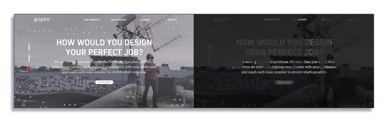
The image on the right is from a tool that displays its contrast ratio, which shows the text doesn’t have enough contrast to be readable.
To ensure you’re compliant, use a color accessibility checker. Simply enter the foreground and background color, and the tool will tell you if your contrast passes.
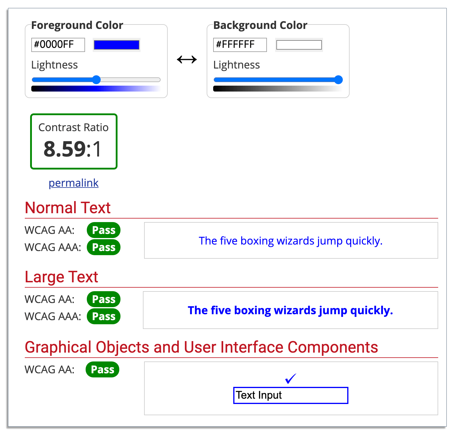
If your contrast ratio fails the checker, then change it to colors that pass.
2. Ensure Your Forms Are Keyboard Accessible
Your forms should be accessible and usable with or without a mouse.
Users should be able to fill out and complete the desired form actions using only their keyboard. They should also be able to navigate through the form using their keyboard’s tab key.
3. Ensure Your Forms Work With Screen Readers
Screen readers translate your text to speech for users with vision disabilities. Ensure all text, including form fields and descriptions, are simple for screen readers to translate, e.g. using one of the aria-xxx elements, which are well supported by most screen readers and assistive technology.
4. Include Text Labels With Form Controls and Inputs
A form control is an interactive element, such as a checkbox, radio button, and menu.
Typically, you’d add text labels to these controls above or to the left of the controls for clarity. However, users with visual disabilities may have trouble associating the labels with the correct controls.
Use HTML, the <label> and <aria-label> elements to associate the text labels with the proper controls. This will allow screen readers to convert the text label to speech and recite it to the user.
Here’s an example of a form with clear text labels above the controls:
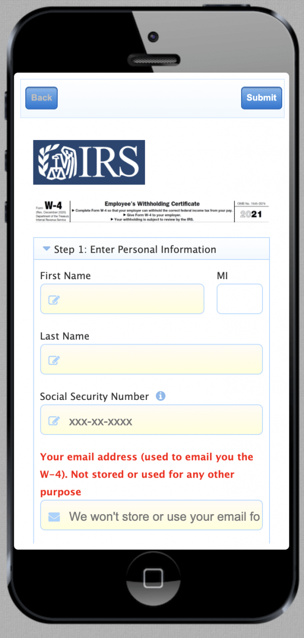
The same applies to text inputs. Without labels connected to inputs, users with disabilities won’t be able to decipher what data goes inside the form’s input fields.
Ensure labels are associated with the controls, not just added to the HTML. Here’s an example:
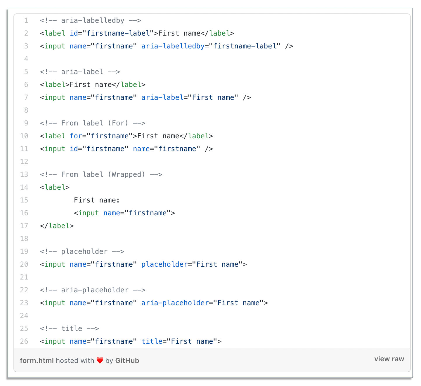
Your code must include the screen reader label/attributes (aria-label, aria-placeholder, aria-labelledby, etc.), or assistive technology cannot properly determine the label’s purpose.
Visit this in-depth resource to learn more about ensuring ADA compliance with form labels and controls and incorporating the correct attributes.
When your text label instructions are long, use a description instead. Similar to your labels, you must also associate your descriptions with the right inputs.
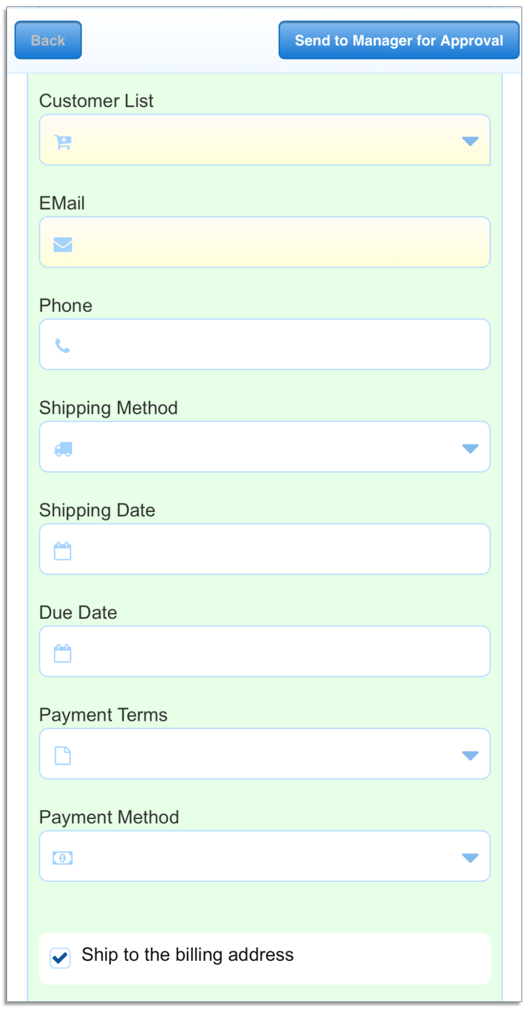
Here’s an example of an expense approval with descriptions:
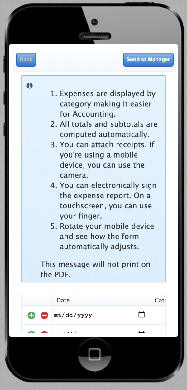
Descriptions help users understand how to use a particular form. Make sure the description itself is ADA compliant so screen readers can properly decipher and recite them.
5. Avoid Using Radio Buttons and Checkboxes
Some browsers don’t support radio buttons, so if possible, avoid using them in your forms. If you have to use them, make sure to include the associated labels. Ask your developer to assist here.
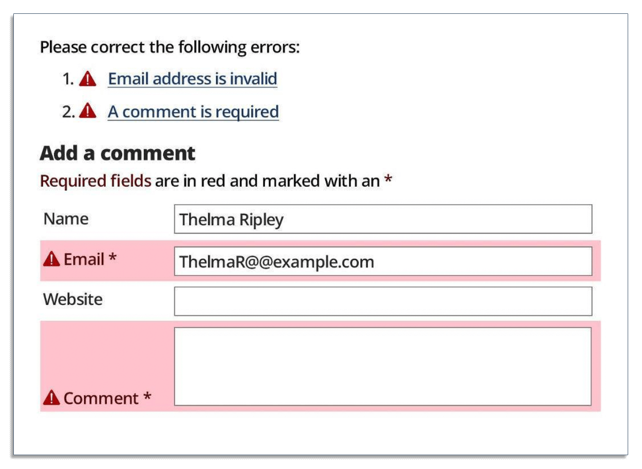
6. Include Descriptive Error Messages
The key to form error messages is to keep them simple and easy for all users to understand. The error messages should be clear for users seeing and hearing the text. It should also provide solutions to the errors, if applicable. No fancy statements or jargon is needed.
Here’s an example of a form with a descriptive error message:
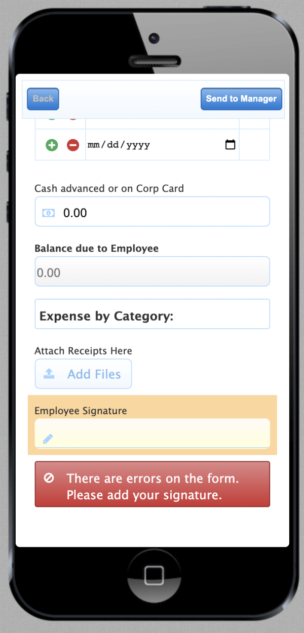
The message above not only tells users that there are errors on the form, but it also specifies what they need to do to fix them.
Tip: Similar to labels, and other inputs, associate errors so screen readers can translate the text.
7. Highlight Required Form Fields
When filling out your forms, all users should be able to clearly identify the required fields:
- Make your input error messages clear and not generic. Opt for “Please complete Name Line 2” instead of “Please complete required field.”
- Outline the required form fields at the beginning of the form.
- Associate a symbol (*) with the field and provide attributes (aria-required) for screen readers.
- Use color to help users perceive required form fields, but don’t rely only on color. Use size, images, and position as well to highlight fields to cater to users with all disabilities.
8. Follow HTML Semantic
Use HTML elements in your forms so screen readers can properly translate.
Here’s a list of the 119 HTML elements, with each one corresponding to a specific purpose (e.g., the <caption> element defines a title for a table).
In addition, when working on form input status (required field, invalid field, etc.), focus on HTML attributes instead of relying on CSS and javascript.
For more information on how to use HTML attributes to make your forms more accessible and ADA compliant, check out this resource.
9. Test Your Forms on Mobile Devices
Some users may be accessing your website from a smartphone or tablet. Make sure to test your forms on different devices before you deploy them.
frevvo’s dynamic form builder allows you to build fully responsive forms that are mobile-friendly out of the box. You can also preview how your forms will look on different devices.
Here’s an example of how a time-off request form looks like on a tablet:
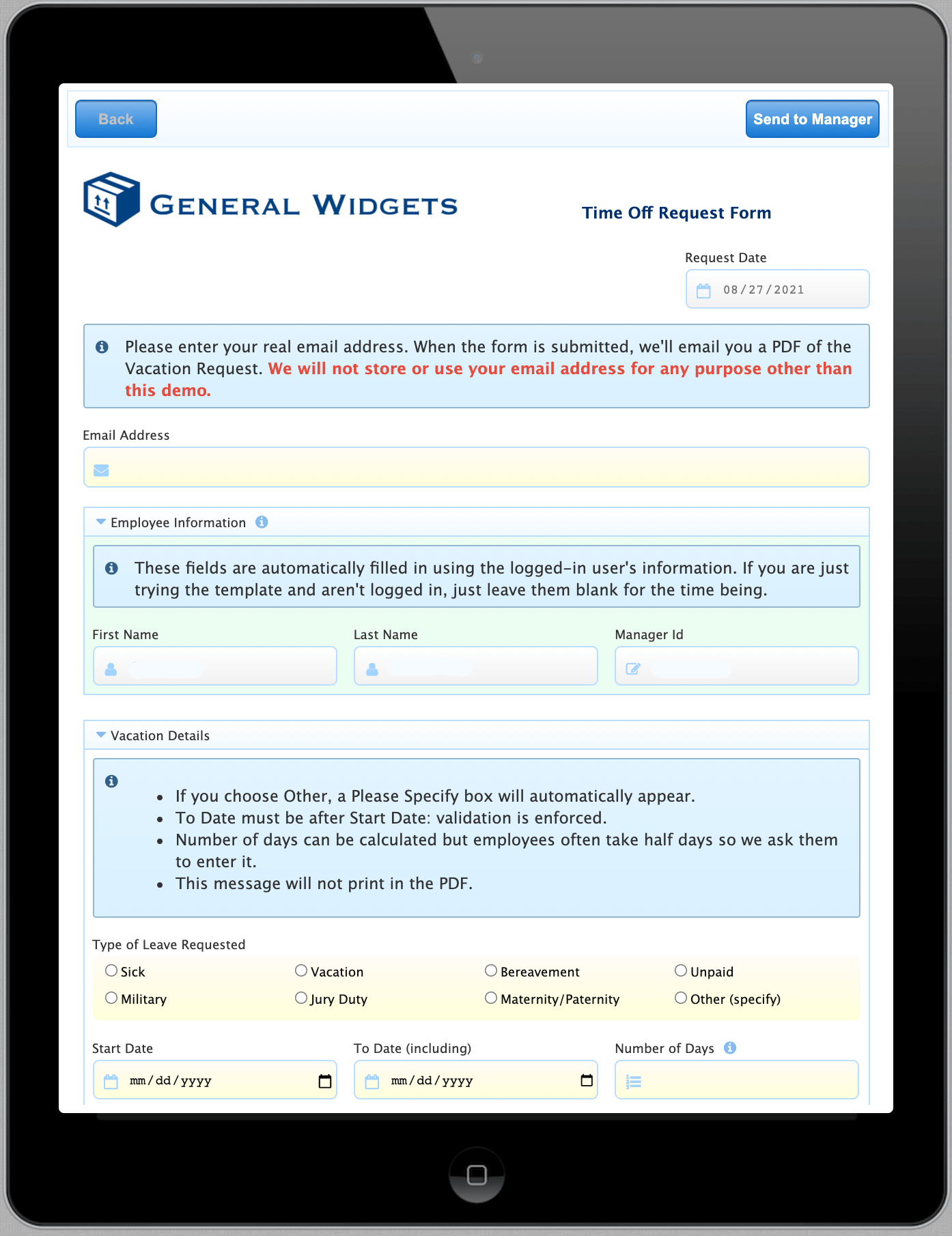
The forms you build also meet ADA and WCAG standards, making them accessible to all your users.
Note that this isn’t an exhaustive list of all requirements for creating compliant forms. If you’re wondering if your forms are fully accessible, use the WAVE accessibility tool and consult with IT and legal professionals.
frevvo Forms: ADA Compliance is a Point and Click Away
Here at frevvo, we know the immense value in making forms more accessible, but we also realize how cumbersome and difficult it can be to fully execute this endeavor.
In addition, it’s expensive for schools, universities and other organizations to make forms compliant because it requires the hands of a skilled developer who also understands WCAG guidelines.
Enter frevvo.
The forms created with our mobile form builder are ADA, Section 508, and WCAG compliant and offer worldwide language support. All you have to do is check a single box in the form’s properties wizard.
That’s it. Your forms are now fully accessible for all users.
Add workflow automation to that and creating accessible forms is a breeze with built-in rules, drag-and-drop fields, dynamic routing, and more. frevvo enables you to automate your routine tasks so you can put time and money back in your pocket.
Conclusion
Even if ADA doesn’t apply to your organization, it’s still good practice to create a website with an accessible design. If users can’t navigate parts of your website or fill out a form, they’ll leave in frustration because of accessibility issues.
And if ADA does apply to your organization, then becoming compliant is crucial as an ADA lawsuit could lead to hefty fines. The good news is that meeting ADA standards with your forms is easy with frevvo.
Let us demonstrate how easy it is to create ADA compliant forms and workflows with a single click.
Try frevvo free for 30 days to create your own ADA compliant forms for your organization. Or contact us for a free demo and we’ll walk you through the software and show you how you can automate your workflows.