
Every person using the web has different abilities when it comes to reading and interacting with online content. Naturally, they have varied needs as well. In this article, we’ll carry forward the theme we started in part one and part two of this series – the importance of a keyboard or screen reader (robust forms of technology) that make information like forms, videos, images, content, menus, and links accessible to people with different abilities. We’ll introduce proposed 2.2 Guidelines from the Web Content Accessibility Guidelines (WCAG) that go beyond both keyboard and screen reader interactions.
The Current Situation with Users and Access
People are always changing or upgrading their devices, software, and browser versions so technology solutions must adapt and keep up, especially for the 1 billion global users who have a disability (visual, hearing, mobility, cognitive, and learning). To meet that need, the WCAG 2.2 has been drafted to continue to create more inclusive user experiences.
The W3C recently released their working draft of WCAG 2.2 by the Accessibility Guidelines Working Group and those guidelines and success criteria build upon earlier versions of WCAG 2.1 and 2.0, which are built from the first version (WCAG 1.0) released in 1999. Now today, WCAG 2.2 introduces additional use-cases. Notably, it includes improvement in support for users of small or touch-screen devices, low-vison users, and users with cognitive, language, and learning impairments. We’ll take a closer look at two Guidelines: “Input Modalities and Dragging Movements” and “Target Size.”
Guideline 2.5.7 Input Modalities/Dragging Movements
The WCAG Guideline “Input Modalities” is specifically focused on “dragging movements” and “target size” (think buttons). Both forms of interaction have a notable impact on users with motor skill impairment.
Dragging movements have become common user interactions for mobile and tablet devices, this presents a challenge to a lot of users. This guideline intends to “make it easier for users to operate functionality through various inputs beyond keyboard” according to the W3C organization, such as using a “single pointer.” However, there is an exception when a dragging movement is “essential.” For example, if a dragging movement is removed and it “fundamentally changes the information or functionality of the content, such as drawing a freeform figure, it should stay as an interaction. The key idea for designers is to implement an inclusive design for dragging functionality such as the up or down buttons or clicking controls.

The Use Story of “Yun”
To illustrate, take a typical user story of Yun an 85-year-old retiree that reads news online, and posts to social media sites to stay connected with his kids and grandkids. Yun has hand tremors, as do many people his age, and it’s impossible for him to hold down the mouse button and drag accurately to “move the items in this list.” To design a better experience for Yun’s abilities and those like him, design clickable up and down arrows to change the order of items in the list. It’s a solid solution that will work for more people too, not just Yun, coined as solve for one benefit many.
To get a full understanding of how to design and develop dragging movements to work for most people, check out the W3C’s guidance on intent, benefits, examples, techniques, and key terms.
Guideline 2.5.8 “Target Size”
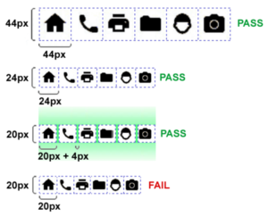
The WCAG Guideline “Target Size” resolves problems with clicking or tapping on user interface (UI) components (such as a button) which are designed with insufficient “region.” It also helps prevent accidentally activating a nearby target because it is too small and too close to its neighboring target. The W3C outlines “an area of at least 24 by 24 Cascading Style Sheet (CSS) pixels” for the size of the target. Depending on the design of the UI components on a page, you may need to enlarge the size of certain targets or increase “padding” around the target. There are three exceptions to this guideline.
- Spacing: The target offset is at least 24 CSS pixels to every adjacent target.
- Inline: The target is in a sentence or block of text.
- Essential: A particular presentation of the target is essential to the information being conveyed, or it is legally required to be presented.
Having a sufficient region of 24 by 24 CSS pixels solves common user experience (UX) frustrations for people with low vision, and especially for people with large finger pads and those with different motor skill abilities. Take Yun for instance. He is shopping online for groceries, during checkout he realizes he needs another item. Instead of hitting “Back,” he accidentally hits “Submit” simply because the buttons are too close together. Taking this into consideration is especially important when designing for various mobile screen sizes.
This illustration from the W3C makes clear the options to pass this guideline. Another key design choice to note about target size relates to zooming. Target size is “independent of the zoom factor on the page; when users zoom in the CSS pixel size (of elements) does not change.” Another design consideration – if there are no targets immediately above or below the buttons, the region passes the Success Criterion.
What We Will Learn Next
Coming next is WCAG 2.2 Guidelines “Predictable” and “Input Assistance.” Until then, to learn more about creating an accessible design strategy for your business, download our guide, Digitally Accessible Experiences: Why It Matters and How to Create Them, and read our UX for Accessible Design series and UpSkill series. To get started on enhancing your digital accessibility, contact our experts about our Accessibility IQ today.