
In this blog, we will learn below points:
- Creating a custom widget in Spire
In this blog post, we will explore the process of replacing creating a custom widget in Spire, a popular content management system. I will provide examples and step-by-step instructions for create a custom widget, along with details on implementing these changes on a local machine.
Creating a custom widget in Spire
A new, custom widget is an excellent alternative if you need to offer totally new functionality to cover your use cases. The latter is normally more effort, but the option you select depends on your unique situation.With a few exceptions, the methods for creating a new widget in Spire are identical to those for overriding an existing widget.In this example, we’ll make a widget that shows how to add custom CMS field definitions.These field definitions are shown as editable components in the CMS.
Example of creating a custom widget in local machine
The Blueprint for this example can be found in /modules/blueprints/example.

All references to directory locations will be relative to the /modules/blueprints/example/src directory.
Please follow below steps:
- Create a directory within the Blueprint. The directory will be located at /Widgets/Common.
- Add a file named ExampleWidget.tsx within that directory and paste the attached code:
/*

This illustrates how to create a widget that makes use of a number of different field definition types.

*/

import { WidgetDefinition } from "@insite/client-framework/Types/ContentItemDefinitions";

import WidgetModule from "@insite/client-framework/Types/WidgetModule";

import WidgetProps from "@insite/client-framework/Types/WidgetProps";

import * as React from "react";


// this is used to help ensure that the names match between props.fields and definition.fieldDefinitions[].name

const enum fields {

checkboxFieldValue = "checkboxFieldValue",

textFieldValue = "textFieldValue",

integerFieldValue = "integerFieldValue",

multilineTextFieldValue = "multilineTextFieldValue",

radioButtonsFieldValue = "radioButtonsFieldValue",

dropDownFieldValue = "dropDownFieldValue",

}


interface Props extends WidgetProps {

fields: {

[fields.checkboxFieldValue]: boolean;

[fields.textFieldValue]: string;

[fields.integerFieldValue]: number;

[fields.multilineTextFieldValue]: string;

[fields.radioButtonsFieldValue]: string;

[fields.dropDownFieldValue]: string;

};

}


const ExampleWidget: React.FC<Props> = props => {

return (

<div>

<div>

Checkbox value:

{props.fields.checkboxFieldValue.toString()}

{props.fields.checkboxFieldValue && <span>Is True</span>}

{!props.fields.checkboxFieldValue && <span>Is False</span>}

</div>

<div>Text value: {props.fields.textFieldValue}</div>

<div>Integer value: {props.fields.integerFieldValue}</div>

<div style={{ whiteSpace: "pre" }}>MultilineText value: {props.fields.multilineTextFieldValue}</div>

<div>RadioButtons value: {props.fields.radioButtonsFieldValue}</div>

<div>DropDown value: {props.fields.dropDownFieldValue}</div>

</div>

);

};


const definition: WidgetDefinition = {

group: "Testing",

fieldDefinitions: [

{

name: fields.checkboxFieldValue,

displayName: "Checkbox",

editorTemplate: "CheckboxField",

defaultValue: false,

fieldType: "General",

tooltip: "checkbox tip",

},

{

name: fields.textFieldValue,

displayName: "Text",

editorTemplate: "TextField",

defaultValue: "",

fieldType: "General",

tooltip: "text tip",

placeholder: "text placeholder",

isRequired: true,

},

{

name: fields.integerFieldValue,

displayName: "Integer",

editorTemplate: "IntegerField",

defaultValue: 0,

fieldType: "General",

tooltip: "integer tip",

placeholder: "integer placeholder",

isRequired: true,

sortOrder: 0,

},

{

name: fields.multilineTextFieldValue,

displayName: "MultilineText",

editorTemplate: "MultilineTextField",

defaultValue: "",

fieldType: "General",

tooltip: "multi line tip",

placeholder: "multi line placeholder",

isRequired: true,

},

{

name: fields.radioButtonsFieldValue,

displayName: "RadioButtons",

editorTemplate: "RadioButtonsField",

options: [

{

displayName: "Yes",

value: "yes",

tooltip: "this means yes",

},

{

displayName: "No",

value: "no",

tooltip: "this means no",

},

],

tooltip: "radio buttons tip",

isRequired: true,

defaultValue: "",

fieldType: "General",

},

{

name: fields.dropDownFieldValue,

displayName: "DropDown",

editorTemplate: "DropDownField",

options: [

{

displayName: "Option1",

value: "option1",

},

{

displayName: "Option2",

value: "option2",

},

],

tooltip: "drop down tip",

isRequired: true,

defaultValue: "",

fieldType: "General",

},

],

};


const widgetModule: WidgetModule = {

component: ExampleWidget,

definition,

};
export default widgetModule;
- Now let’s append this code snippet to the end of the file. Every widget in Spire needs to default export a WidgetModule. It describes to Spire how the widget is rendered and displayed in the CMS, among other things.
const widgetModule:

WidgetModule = { component: ExampleWidget, definition, };

export default widgetModule;
-
Uncomment below code from
start.tsx
file in custom blueprint:
import { addPagesFromContext, addWidgetsFromContext } from "@insite/client-framework/Configuration";

// Load all custom widgets so they are included in the bundle and enable hot module reloading for them. Do not do this for the ./Overrides folder

const widgets = require.context("./Widgets", true, /\.tsx$/);

const onHotWidgetReplace = addWidgetsFromContext(widgets);

if (module.hot) {

module.hot.accept(widgets.id, () => onHotWidgetReplace(require.context("./Widgets", true, /\.tsx$/)));

}
- Start Spire.
- After Spire is up and running, sign into the CMS at http://localhost:3000/contentadmin.
- After we are signed in, edit the home page.
- Scroll to the bottom of the page and add a new row.
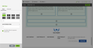
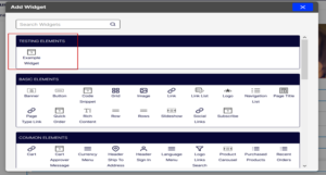
- Add the ExampleWidget widget to the new row. We can find it within the Testing Elementsgroup in the Add Widgetmodal.
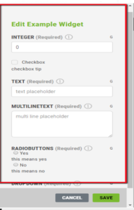
- After adding the widget to the page, we can customize the widget using the field definitions defined in code. The CMS displays them in the sidebar.
- Now, publish the change you just made.
- If we log out of the CMS and go to the Home page, we can see our new widget on the page.

Conclusion:
Creating a custom widget in Spire can be accomplished by following a few straightforward steps. By using the provided examples and implementing these changes on a local machine, website administrators can efficiently update and customize their Spire-powered websites to meet their evolving needs.