‘’Data Analytics is not Excel
Data Analytics is not SQL
Data Analytics is not Tableau
Data Analytics is not Python or R
Data analytics is not about tools, rather, it is about your ability to spot patterns in data and transform raw data into actionable insights. The tool are vehicles, they aren’t destinations.’’
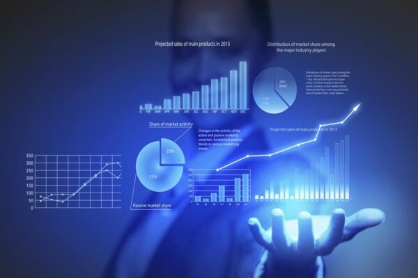
DATA VISUALIZATION:
Data visualization is picture of data or information in charts, graphs, maps or other pictorial formats. This makes it easier for public to see trends, recognize relationships and uncover outliers in their data. Patterns, correlations and trends that might go unseen in text-based data, can be exposed and recognized easier with data visualization. Data visualizations turn small and large dataset into visuals that are easier for the human brain to process.
- Data visualization grants a visual summary of data and makes it easier to recognize trends and patterns than looking through thousands of rows on a spreadsheet.
- It is easier to interconnect information and insights in the form of graphics than text or numbers.
- Data visualization takes the information from numerous markets to give you insights into which audiences to focus your attention on and which ones to stay away from.
EXAMPLE OF VISUALIZATION
A business has outlet in 4 cities, and each branch changes the product price every month. This leads to an equivalent variation in the sales. Here is the performance of the 4 branches with their monthly price and sales for each month.
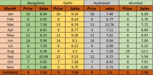
Looking at the average, the four branches have an identical performance.
In fact, the four cities are totally different in behavior.
- Bangalore’s sales have normally increased with
- Delhi shows a decline in sales elsewhere a price of
- Hyderabad has a nearly perfect rise in sales with price, excluding for one aberration.
- Mumbai’s sales vary despite a nearly constant
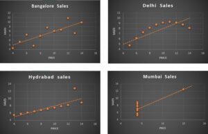
To gain intricate insights like above, we use data visualization.
BENEFIT OF VISUALIZATION
- Faster decision making:
By Manipulating and viewing large data sets in visual presentations, you can recognize the story your data tells at quick glance, rather than focusing over ton of numbers and tables for hours or weeks.
- More data Exploration:

The Future of Big Data
With some guidance, you can craft a data platform that is right for your organization’s needs and gets the most return from your data capital.
The greatest data visualization tools allow handlers to cooperate with all their data, directly on the chart to notice unseen patterns, see data relationships and uncover actionable insights.
- Better track business initiatives:
Dashboards helps people easily track the performance of business initiatives by allowing them to rapidly see how everyday process touches key performance indicators (KPIs)
- Extend your analytics investment:
Because visuals make it easier to understand data, everyone in an organization (include business users) can explore data and find insights that improve company growth and effectiveness.
BEST PRACTICE FOR VISUALIZATION
- understand your data:
Recognize the magnitude and scope of your data, with what kind of data you want to connect and the types of decisions you want public to make.
- Make form follow function:
As stated above, be strong on which associations in your data you are trying to display earlier you choose your chart. Recognize what your audience want to achieve and how you can finest help them gain insights.
- Proper title
Understanding the graphs and charts proper title should be given to the visuals.
- Keep visual simple:
Size up your data and determine the visual techniques you should use to present your story in simplest way possible.
- Embed data everywhere:
From website and portals to apps business processes, let users visualize their data anywhere they make decision
INDUSTRIES THAT USE VISUALIZATION:
- Banking:
Banking is one of prime sector in our country. Each day many reports are being created in many banks. Visualization can combine complex reports and can create actionable insight.
- Retail:
Retail is a deeply data driven industry. Retail businesses need to track what is trendy right now, in real time. This would help them to forecast their needs and make plans. The retail organizations can have the product they want on-hand and adapt to their customer’s needs as they change. They can create dashboards to track the Key performance indicators those are crucial to the retail industry.
- Healthcare:
Data visualization is used more by healthcare administration team rather than doctors. With the help of visualization hospitals can bring down their operation costs. It makes the data readily available to use and make it in an understandable format for the doctors, nurses, and the administration. Interactive widgets can also be created with which a lot of time and effort can be saved.
- Education:
The last industry that we will see is the education sector. This might come as a surprise for many people. But the truth is data visualization can help a lot in education sector. According to a study, visual helps in schoolrooms can help in improving the education process by up to 400%. Students would have a great experience learning through visuals rather than just texts and numbers. Data visualization can also help in tracking the student’s performance. A student’s progress might go unnoticed if there is no tracking system.
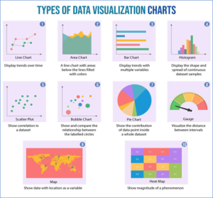
DIFFERENT CHART IN VISUALIZATION
CHALLENGES IN VISUALIZATION:
- Lack of data understanding
No matter how nice your visuals look, if the underlying data doesn’t express the right story, users won’t get value from them. To avoid telling partial, misleading or inaccurate stories, understand your data first. And be sure to spot and resolve any data issues earlier you publish.
- Clutter
Trying to pack too much data into a visual can leave users jumbled and frustrated. Instead, bound the number of KPIs in your dashboard, use pie charts for limited data sets, choose colours carefully, and use the simplest format possible.
- Lack of data governance
While many people feel happy using spreadsheets and ungoverned analytics tools to create their own performances, this presents many tasks. Implement correct data governance practices to avoid wrong data stories, incomplete analyses, and non-standard visuals.
- Reliance on manual processes
When manipulators create visualizations by manually manipulating data in spreadsheets, they can make data and mathematical mistakes, waste hours of efficiency, and distribute unsuitable information. AI and machine learning can help you automate time-consuming responsibilities and overcome these tasks.
CONCLUSION:
Good data visualization should link a data set clearly and effectively by using visuals. The best visualizations make it easy to realize data briefly. They take complex data and break it down in a way that makes it simple for the target audience to understand and on which to base their decisions.
Happy Reading and Learning.